Your first steps building a trading algorithm
Let us say you are planning to build your own algorithmic trading model.
You will most likely use only price (Close) data for your model and algorithm, but soon you will discover, that your model does not perform well.
Soon you will use typical OHLCV data, which refers to Open, High, Low, Close, Volume, which is already better, but the model does not seem to perform quite well enough.
What can you do?
Handy Colab Notebook to follow along: https://colab.research.google.com/drive/1ywqti1TuTDY_Z11ry0x4ITclCwxnXAeI?usp=sharing
Gist:
https://gist.github.com/JustinGuese/019e0e71100abe6555f78c32fd0b10a9
What does a Machine Learning Trading Bot like?
The typical machine learning algorithm can only work with the data it got. It (usually) can not create new features or interpretations like “If volume increases and the 3rd derivative of price rises, the price will most likely go up”, but instead can only “look” at the data it got. These would be calculations like “if the price is above 100 USD, and the volume above 2000, the price will most likely go up”.
Newcomers to Machine Learning are now trying to solve this problem by training for decades, or using more and more GPUs, but a way more efficient way would be to feed that algorithm with additional data, such that it can use more resources to infer it’s calculations.
This can be achieved by:
- Getting more data (a bigger timespan)
- Adding statistical metrics
- Adding your own signals and interpretations
Hands-on: Enhancing your data
First steps - Getting your data
First, let us grab some basic OHLCV data. I like the yfinance (https://pypi.org/project/yfinance/) module for its simplicity. It is not comparable to live-streams of data, but on the other hand, it’s free and great for experimentation!
pip install yfinance pandas numpy matplotlib ta
Import that module as well as Pandas Numpy Matplotlib
import yfinance as yf
import matplotlib.pyplot as plt
import pandas as pd
Get some stock data, interval and period refer to the timeranges.
interval accepts values like 1m,2m,5m,15m,30m,60m,90m,1h,1d,5d,1wk,1mo,3mo
period accepts values like 1d,5d,1mo,3mo,6mo,1y,2y,5y,10y,ytd,max
Not all combinations work, like 1m (1 Minute) intervals are only working with 7d max, 1h (1 hour) with 3 months max (needs to be written as 90d). But let’s work with daily data first
df = yf.download("MSFT",period="5y",interval="1d")
df.head()
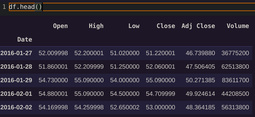
Quick excourse: What the heck is Open, High, Low, Close, Adj Close, and Volume? Where is the price?!
There is no “one price” in the stock market! You can imagine OHLCV data as “buckets” or “bins” in time, summarizing all the trades that occurred in that window. The typical “line” chart you know usually refers to the “Close” price of that stock in time range X, e.g. the value the stock had at the close of the time range.
If we are looking at daily data, “Open” refers to the average (!) stock price at open of the markets, whilst “Close” refers to the average (!) price the stock had at the close of markets. If looking at hourly data, the “Open” refers to the beginning of that hour, like 11 am, and the “Close” to the close of that hour, so 11:59:59 am.
Equally “High” is the highest trade/price recorded in that time frame, and “Low” the lowest one. Volume refers to the number of assets or stocks traded in that time range.
Meaning if e.g. “Low” and “Close” of a column are close to each other, we are most likely seeing a downwards trend as the close is the current low. Also if Volume is high, there is a lot of trades going on, so if e.g. the Volume is higher than usual there seems to be something going on in the market. But anyway, head over to https://www.investopedia.com/ for that, we will continue coding now!
What is “Adj Close”?
This is important, as most ML algorithms are terribly confused by “normal” close-data. If there is a split in the stock, the data will look like the price has an insane drop.
The reason is, simply said, that if a stock get’s too expensive, the company decides to “split” the stock in two. Does that mean my investment halves? Of course not, you will simply get double the stocks you are holding, so on paper you still hold the same value of that stock.
Interestingly a split usually causes prices to rise (silly humans!), and if your machine learning algorithm sees a huge drop in price it will most likely sell the hell out of that stock.
For this reason, you should always use “adjusted” values, which can be imagined as “cleaned” price data, keeping in mind the splits, dividends, and all other events not affecting the true value of data. Therefore try to always use adjusted data for your algorithms!
In the case of yfinance it is easy to do, as we can just use “Adj Close” instead of “Close”.
Plotting the data
Looking at the data we can already see a nice, well-known curve
plt.plot(df["Adj Close"])
Step two: Enhancing your data with statistical data
As said above, we need to create more information from our data for the algorithm to use, as it can not do this on its own.
I like to use the library ta (https://github.com/bukosabino/ta) as again, it is super easy to use and contains 100+ statistical calculations.
Install and import it with
pip install ta
from ta import add_all_ta_features
from ta.utils import dropna
Now if you already know which values you want to use you can only pick these, oooor we just smash all 100+ at our data:
df = dropna(df) # clean nans if present
df = add_all_ta_features(df,open="Open", high="High", low="Low", close="Adj Close", volume="Volume")
So what have we done?
df.columns
Index(['Open', 'High', 'Low', 'Close', 'Adj Close', 'Volume', 'volume_adi',
       'volume_obv', 'volume_cmf', 'volume_fi', 'volume_mfi', 'volume_em',
       'volume_sma_em', 'volume_vpt', 'volume_nvi', 'volume_vwap',
       'volatility_atr', 'volatility_bbm', 'volatility_bbh', 'volatility_bbl',
       'volatility_bbw', 'volatility_bbp', 'volatility_bbhi',
       'volatility_bbli', 'volatility_kcc', 'volatility_kch', 'volatility_kcl',
       'volatility_kcw', 'volatility_kcp', 'volatility_kchi',
       'volatility_kcli', 'volatility_dcl', 'volatility_dch', 'volatility_dcm',
       'volatility_dcw', 'volatility_dcp', 'volatility_ui', 'trend_macd',
       'trend_macd_signal', 'trend_macd_diff', 'trend_sma_fast',
       'trend_sma_slow', 'trend_ema_fast', 'trend_ema_slow', 'trend_adx',
       'trend_adx_pos', 'trend_adx_neg', 'trend_vortex_ind_pos',
       'trend_vortex_ind_neg', 'trend_vortex_ind_diff', 'trend_trix',
       'trend_mass_index', 'trend_cci', 'trend_dpo', 'trend_kst',
       'trend_kst_sig', 'trend_kst_diff', 'trend_ichimoku_conv',
       'trend_ichimoku_base', 'trend_ichimoku_a', 'trend_ichimoku_b',
       'trend_visual_ichimoku_a', 'trend_visual_ichimoku_b', 'trend_aroon_up',
       'trend_aroon_down', 'trend_aroon_ind', 'trend_psar_up',
       'trend_psar_down', 'trend_psar_up_indicator',
       'trend_psar_down_indicator', 'trend_stc', 'momentum_rsi',
       'momentum_stoch_rsi', 'momentum_stoch_rsi_k', 'momentum_stoch_rsi_d',
       'momentum_tsi', 'momentum_uo', 'momentum_stoch',
       'momentum_stoch_signal', 'momentum_wr', 'momentum_ao', 'momentum_kama',
       'momentum_roc', 'momentum_ppo', 'momentum_ppo_signal',
       'momentum_ppo_hist', 'others_dr', 'others_dlr', 'others_cr'],
      dtype='object')
Well, that should be enough for now!
Also, there is still a lot of nans in there, as some values are only calculated if enough time passed. In my experience filling them with zeros works quite well, even though there are more advanced techniques for that.
df = df.fillna(0)
Step three: Creating your own signals
Now it is time to translate your weird trade ideas into numbers!
Let us start with the classic Moving Average cross. The idea is as follows: If a short moving average crosses a slower moving average, it either indicates a price rise or fall, depending on the direction of the cross.
Again, have a look at investopedia for details: https://www.investopedia.com/articles/active-trading/052014/how-use-moving-average-buy-stocks.asp
Our goal is to first calculate the SMA’s, and then to formulate crosses as 1 and -1, and 0 to signal no cross.
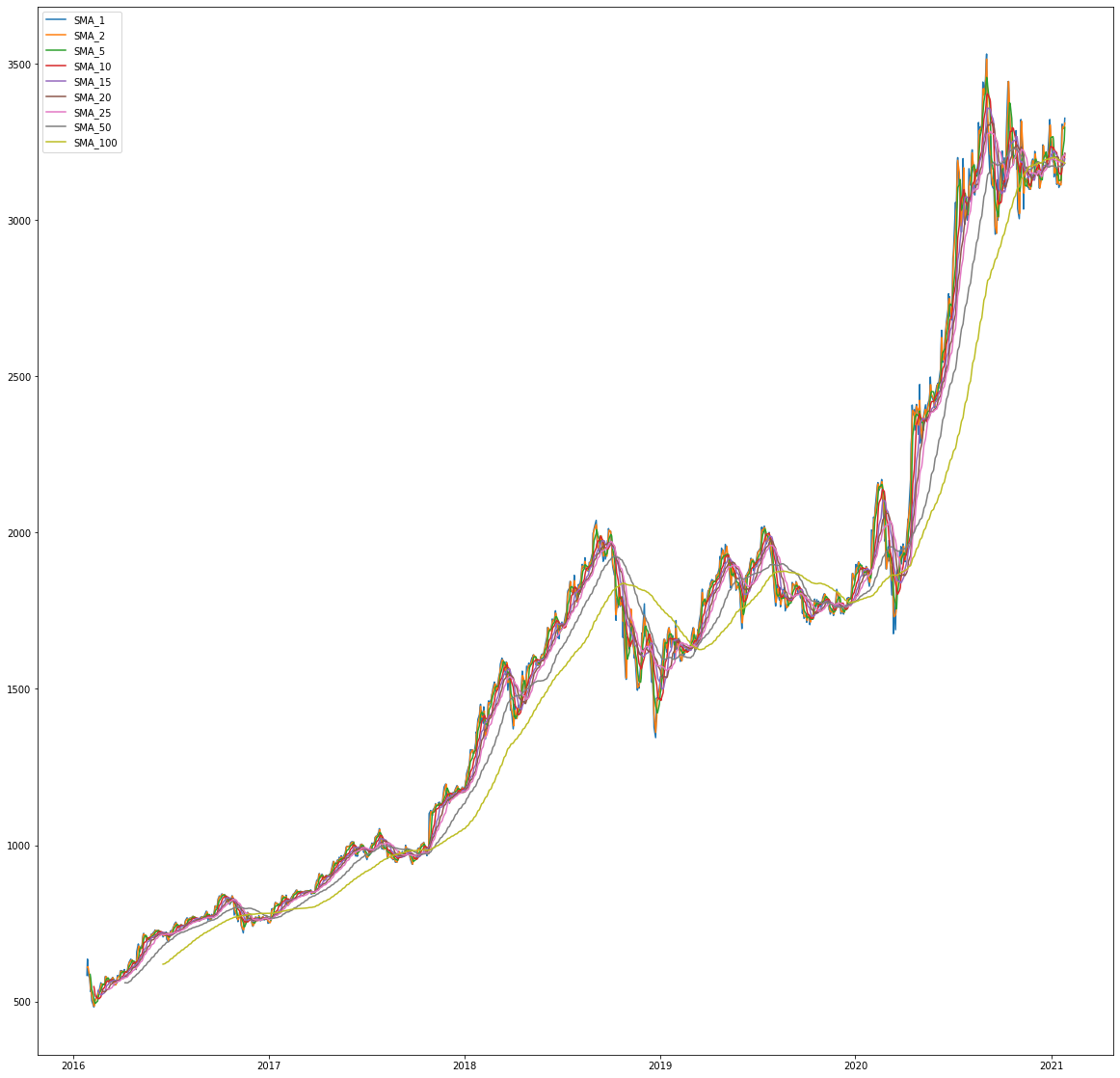
Creating Simple Moving Averages
# creating simple moving averages
averages = [1,2,5,10,15,20,25,50,100]
for average in averages:
  df['SMA_%d'%average] = df["Adj Close"].rolling(window=average).mean()

# visualize only SMAs
filter_col = [col for col in df if col.startswith('SMA')]
df[filter_col].tail()
And some visualization:
# results in bigger figures
plt.rcParams["figure.figsize"] = (20,20)
for filter in filter_col:
  plt.plot(df[filter],label=filter)
plt.legend()

Creating a crossover signal
Let us use a little helper function
def createCross(data,fastSMA,slowSMA):
  fast = 'SMA_%d'%fastSMA
  slow = 'SMA_%d'%slowSMA
  crossname = "cross_%d_%d"%(fastSMA,slowSMA)
  previous_fast = data[fast].shift(1)
  previous_slow = data[slow].shift(1)
  neg = ((data[fast] < data[slow]) & (previous_fast >= previous_slow))
  pos = ((data[fast] > data[slow]) & (previous_fast <= previous_slow))
  data[crossname] = 0
  data.loc[neg,crossname] = -1
  data.loc[pos,crossname] = 1
  return data
And now you could either insert custom values or follow our example and just take the cross products:
for fast in averages:
  for slow in averages:
    if fast != slow and slow > fast:
      df = createCross(df,fast,slow)
This created a perfect classification signal signaling an upwards cross with 1, and a downwards cross with -1, with 0 being a neutral (no-cross).
This is just one example of what further signals you can provide.
Creating a percentage change column
And to add another example, if you are trying to predict the percentage change you will need a column showing the percentage change to the previous time range. This can luckily be easily done using pandas.
df["pct_change"] = df["Adj Close"].pct_change()

Date
2021-01-21    0.013363
2021-01-22   -0.004463
2021-01-25    0.000538
2021-01-26    0.009754
2021-01-27   -0.010484
Name: pct_change, dtype: float64
What a perfect signal for a regressional model!
Summary
Before we added our enhancements the dataframe just contained 5 columns, not much for a machine learning model!
In the end, after adding statistical values and our own signals, we already reached 135 features and columns of our dataframe!
So much better for your model!
What are your thoughts about this process? Did I miss something? Comment below!
Do you want to read more articles by Justin? Head over to my website for more!